Amended 11 March 2016
I wanted to produce a basic dotplot using the LaTeX pgfplot package. I looked for guidance in the extensive manual but didn't find what I wanted (that is not to say it's not there). I managed to find a workaround, which I have shared here. The results are not perfect, but will do for now.
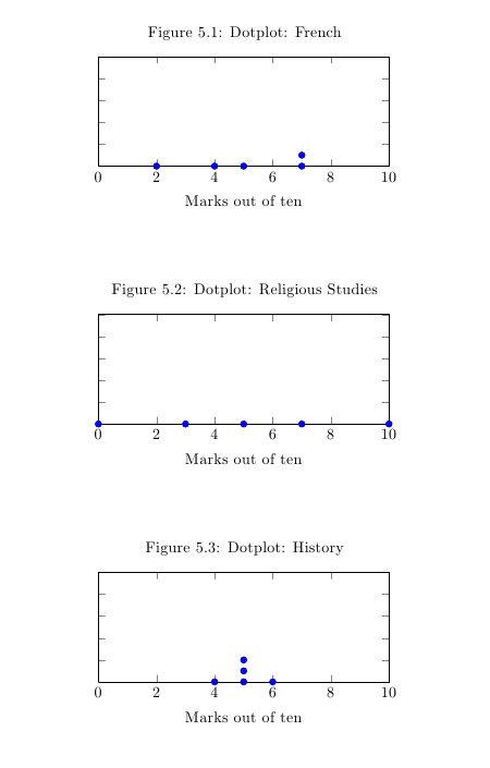
This is the table containing my data:
| Subject | Marks out of ten | Mean Average | Median average |
| French | 2, 4, 5, 7, 7 | 5 | 5 |
| Religious Studies | 0, 5, 10, 7, 3 | 5 | 5 |
| History | 5, 5, 4, 6, 5 | 5 | 5 |
I used the scatterplot as the basis for the dotplot and worked out this code.
I did three of these. Here are the results. Not too bad.
\documentclass{article}

\usepackage{pgfplots}

\pgfplotsset{compat=1.9}

\begin{document}

\begin{figure}

\centering

\caption{Dotplot: French}

\begin{tikzpicture}

\begin{axis}[

xlabel={Marks out of ten},

ylabel={},%no label for the y axis

yticklabels={}, %no numbers displayed on the y

ymin=0,

ymax=10,

xline,

xmin=0, %sets the minimum of the x axis

xmax=10, %sets the max of the x axis.

%As the test was out of ten I have set max to 10.

]

\addplot[scatter,only marks,

scatter src=explicit symbolic]

coordinates

{

(2,0) %the first number is the marks out of ten (the x axis).

% Use 0 for the y axis until the second occurrence.

(4,0)

(5,0)

(7,0)

(7,1) %the second number here is 1 because we have already used 7,0.

%This is because 2 people got 7 out of 10.

};

\end{axis}

\end{tikzpicture}

\end{figure}

\end{document}


